Seaborn Basics

Use the Template to explore the basics of Seaborn (an extension to Matplotlib). Create new cells with # %% as necessary.

To be able to read Excel files and use Seaborn, install the required packages with mamba install seaborn xlrd -c conda-forge (in the terminal), and also add them to the environment.yml file.

Use the Plotting section, the Seaborn Tutorial, and the Seaborn API Reference for help.

Template
# %%
# Import pandas, matplotlib and seaborn


# %%
# Import the stats4life marathon dataset in excel format
# ('http://www.stats4life.se/data/marathon.xls')
# This dataset was used in the article "Hyponatremia among Runners
# in the Boston Marathon" from NEJM 2005 [.read_excel]


# %%
# Explore the dataset with pandas to learn the names of the 17 columns and
# what type of values they contain [.info and .head]


# %%
# Use seaborn to create a histogram of the frequency of the sodium
# blood values [.histplot]


# %%
# Add a Kernel Density Estimate to smoothe the histogram to show the
# distribution [keyword kde]


# %%
# Stratify the values by female and male runners [keyword hue]


# %%
# Make the plot into and object named fig
# Add labels to the axes, and add a title [.set]
# Update the legend of the two strata [plt.legend]


# %%
# Save the figure
Solution
# %%
# Import pandas, matplotlib and seaborn
import pandas as pd
import matplotlib.pyplot as plt
import seaborn as sns

# %%
# Import the stats4life marathon dataset in excel format
# ('http://www.stats4life.se/data/marathon.xls')
# This dataset was used in the article "Hyponatremia among Runners
# in the Boston Marathon" from NEJM 2005 [.read_excel]
df = pd.read_excel("http://www.stats4life.se/data/marathon.xls")

# %%
# Explore the dataset with pandas to learn the names of the 17 columns and
# what type of values they contain
# [.info and .head]
df.info()
df.head()

# Use seaborn to create a histogram of the frequency of the sodium
# blood values [.histplot]
sns.histplot(data=df, x="na")

# %%
# Add a Kernel Density Estimate to smoothe the histogram to show the
# distribution [keyword kde]
sns.histplot(data=df, x="na", kde=True)

# %%
# Stratify the values by female and male runners [keyword hue]
sns.histplot(data=df, x="na", hue="female", kde=True)

# %%
# Make the plot into and object named fig
# Add labels to the axes, and add a title [.set]
# Update the legend of the two strata [plt.legend]
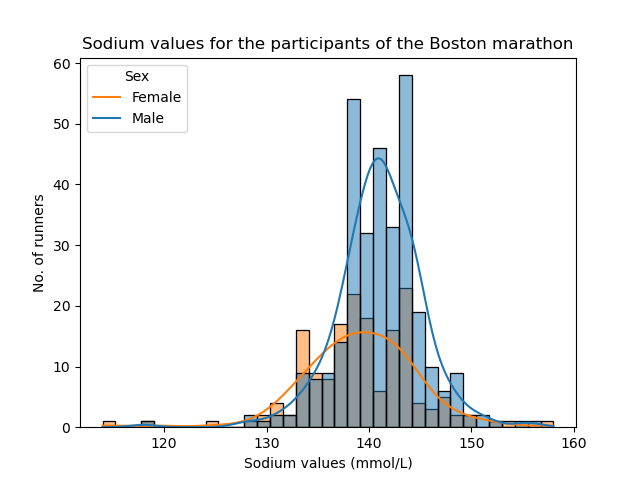
ax = sns.histplot(data=df, x="na", hue="female", kde=True)
ax.set(
    xlabel="Sodium values (mmol/L)",
    ylabel="No. of runners",
    title="Sodium values for the participants of the Boston marathon",
)
ax.legend(title="Sex", loc="upper left", labels=["Female", "Male"])

# %%
# Save the figure
fig = ax.get_figure()
fig.savefig("my-first-seaborn-figure.png")

My First Figure